Case Study, 2021
BumbleBFF
Introduction
About Bumble
Founded in 2014, Bumble began as a dating app for women to make the first move. Only a few years later, Bumble is a community of over 100 million across six continents. After finding success in the dating market, Bumble has expanded to friend matching.
Timeline
Two weeks, April 19th - May 3rd 2021
My Role
Working alongside designers Onaiza Kazi and Nick Calhoun, we were committed to collaboration and worked on every phase of the project together. We are proud of our communication and our results.
Tools
Figma, Fig-Jam, Trello, UX Methods including, User Personas, Affinity Mapping, Synthesis, C&C Analysis, Research, Visual Design, Interaction Design, Prototyping, and Testing.
The Brief
Bumble’s friend-matching is a clone of their dating platform, you can only search for friends of the same gender, and you must make a binary decision on whether to pursue a friendship with them — match or no match. Bumble wants to evaluate the current effectiveness of this approach and determine ways to refine and add features to make the friendship search more effective.
Binary Decision 1, Gender
When onboarding, Bumble asks users to identify their gender. If a user selects woman or man, Bumble assumes you want to befriend folks of your same gender. While the non-binary option may seem inclusive, once you select that option, Bumble then, asks you to specify if you would like to see only women or men on your BFF feed. Asking someone who identifies as outside the binary to choose a binary defeats the purpose of including more than two gender options.
Binary Decision 2, Swiping

Users are again forced to make a binary
decision by swiping left or right to potentially match with a friend. This is a clone of the
dating algorithm and does capture the
uniqueness of friendship.
Research
Our goal was to capture the uniqueness of the friendship-making process as it differs from dating. We interviewed our current friends and partners to identify what friendship means, how people make friends, and the essential values in friendship.
We synthesized what we gathered from our interviews into the following statements.

Then, we synthesized our insights into two personas who would use BumbleBFF.
Arden
Our primary persona. She needs to find people who share her same interests because she doesn’t like to go places alone.

Angela
Our secondary persona. She needs an easier way to find friends eager to try new things because she is an adventurous person who craves new experiences.

Analysis
We conducted competitive and comparative analysis to understand how other applications approach friendship first.

Defining Friendship
Combining this analysis with our user interviews, we still had questions surrounding
1. What information was important in making friends?
2. Should we allow users to filter their friend results, if so, by what categories?
3. What categories to include for user interests?
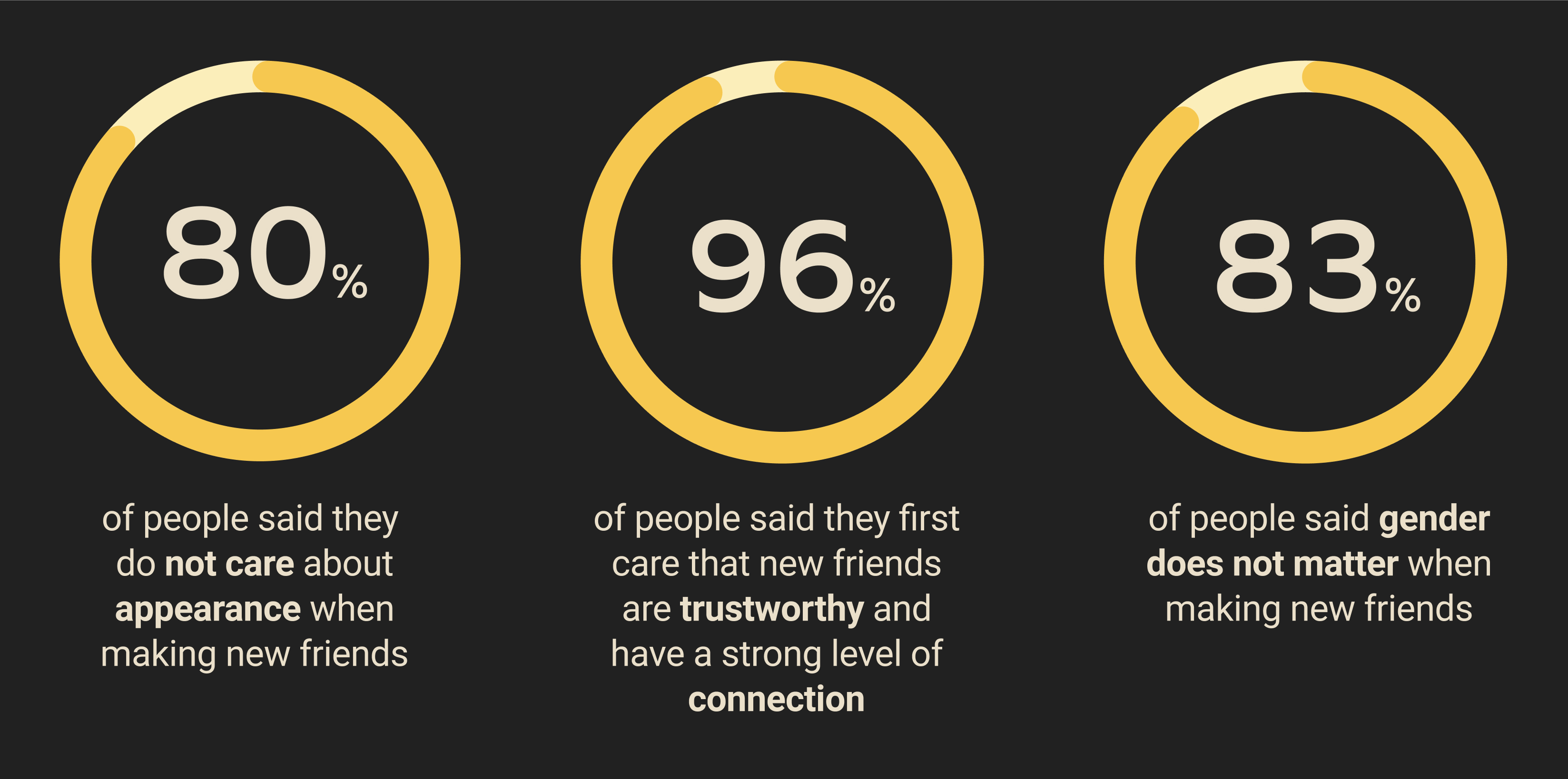
4. How important is appearance when making new friends?
5. How important is gender when making new friends?
To answer these questions, we did a survey completed by 25 participants. The survey validated our assumptions that Bumble’s categories are limiting, and people do not value gender or appearance when making new friends.
Iteration
Next, we began sketching and iterating based on our research. After sketching and low-fidelity. We build a mid-fidelity prototype for user testing. We considered …
1. How might we mitigate the awkwardness of getting to know someone online?
2. How might we help users connect across common interests, shared affinity, and similar personalities?
3. How might we help users find activities to do with groups of people to facilitate an environment for friendship to form?
4. How might we capture the uniqueness of the friend-making process as it differs from dating?
Through design studio iterations and user testing, we iterated our prototype from low to mid to high fidelity.
After user-testing the prototype, we learned
a. Lack of visual consistency is confusing. We each designed parts of the prototype that made it confusing for users to navigate because each section looked different.
b. We needed to have clear copy. On onboarding, users stumbled during confusing questions. In some places, the lack of explanation made users confused about what to do.
c. We needed to fix the hierarchy of the group section, users were unsure of what to click on to join a group.
Additionally, we validated our prototype as
100% of our users were able to complete onboarding successfully.
100% of users were able to message, find an individual and invite them to chat.
100% of our users were able to find the groups page, request to join the group that
wants to go rock climbing.

Refining and Adding Features
Through user interviews, users reported that the swiping feature is a common UI element in dating apps. Once they see swiping, they are immediately thinking of taking it. In order to start from friendship, we removed swiping so our users did not come in with any expectations of dating conventions.
While some of our users’ interviews reported they thrive in individual friendships, some prefer group friendships. We added a group friendship feature to facilitate the environment for friendship to occur through shared interests.
Adding Group Friendships, Hives
Color Change
In the App Store, Bumble displays each of their three relationships with different colors. Bumble dating is yellow, BumbleBFF is blue, and BumbleBizz is orange. Looking through the app details, this visually separates each category which corresponds with the relationship type changing from dating to friendship to networking. In order to have the same effect within the app, we followed these color guidelines changing BumbleBFF from yellow to blue.
Why the Change?
Current Colors

Recommended Colors
Profile Adjustments
We wanted to focus less on physical appearance and more on personality traits. To do this, we decreased the number of physical pictures, included more creative options like having a self-portrait, and added categories relating to interests, not their only lifestyle.
With our new features, BumbleBFF has an opportunity to provide different subscription models for each of their modes. For example, upon subscribing, you will gain access to Mystery Matches. The algorithm will give you a random friend match to help folks find friends that they may not match with based on the chat algorithm.
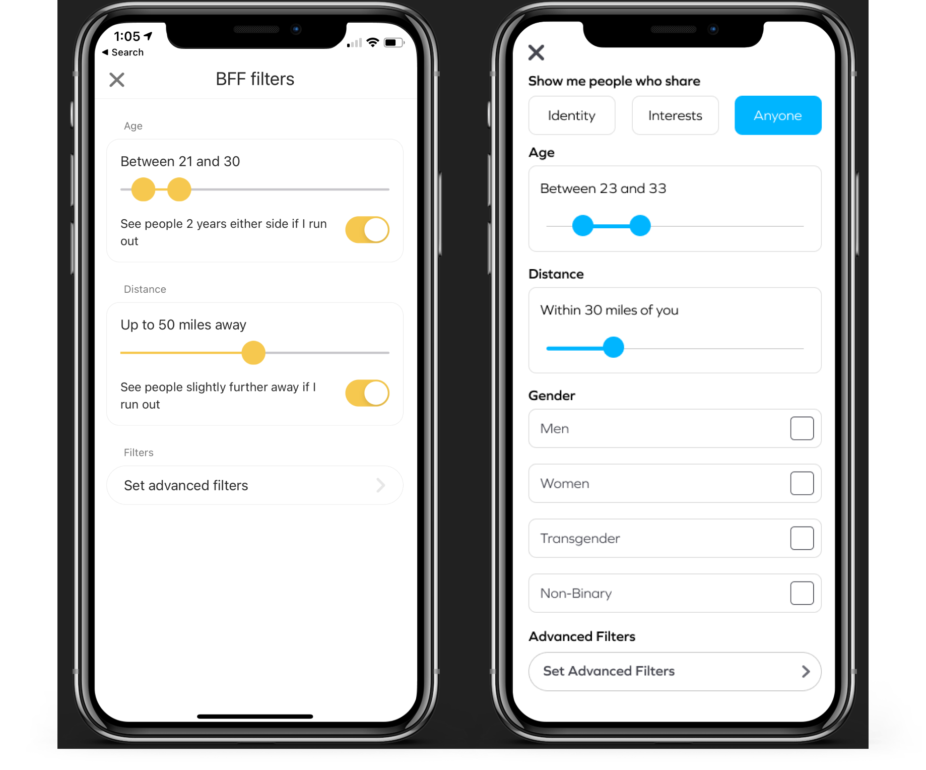
Adjusting Filtering Options
Increasing Monetization
With our new features, BumbleBFF has an opportunity to provide different subscription models for each of their modes. For example, upon subscribing, you will gain access to Mystery Matches. The algorithm will give you a random friend match to help folks find friends that they may not match with based on the chat algorithm.
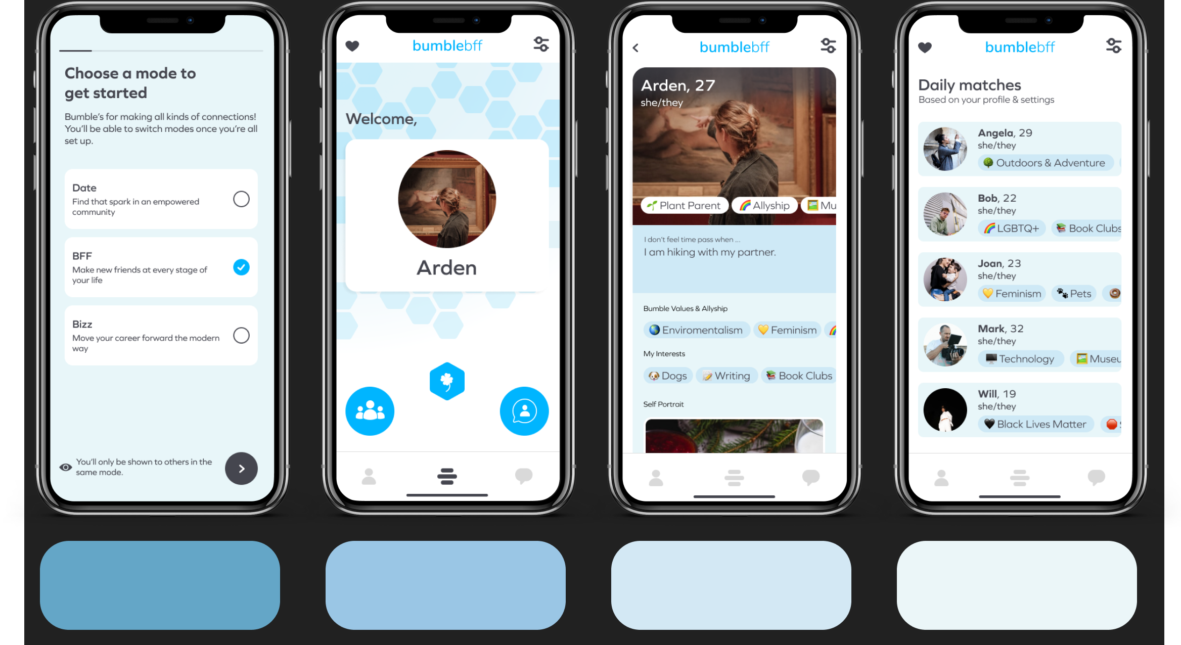
Final Prototype
In this walkthrough, we follow Arden as she creates a profile and starts to chat with Angela. Then we flip to Angela’s perspective and follow her as she asks to join a rock climbing group.
Try your own walkthrough in our figma file
Next Steps
We want to provide a quick way for users to meet other people with their same interests.
More user testing would help us further develop ways to monetize and incentivize app usage
We want to explore what landing page would increase time spent on the app.
More testing, and research would help illuminate whether our information architecture is sufficient. we would also want to expand our research beyond 25 participants.
We would be curious about which filtering options users would use since it is possible we had skewed results in our research in what users ranked as important and what is truly important.
